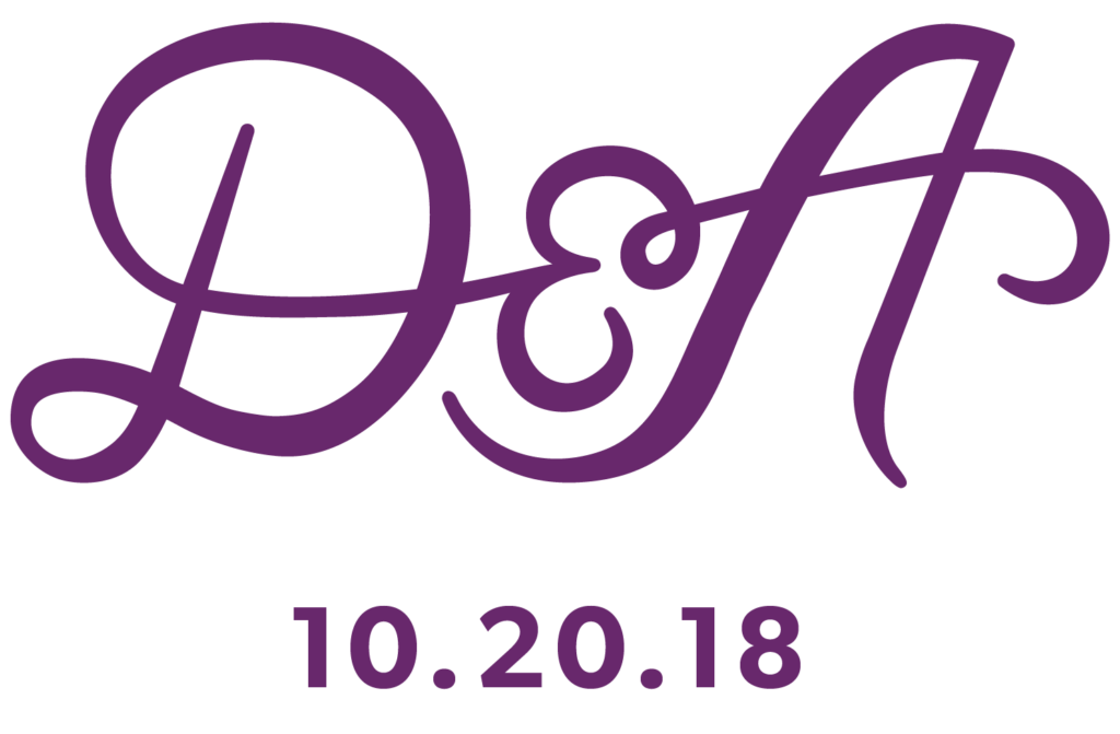
Branding and illustration for my sister’s wedding this past October. The entire brand uses different values of purple, her favourite colour, with pops of grey and charcoal.
I created an emblem with her and her now husband’s initials, which I then made into a wax seal that they used to close the envelopes containing the invitations.
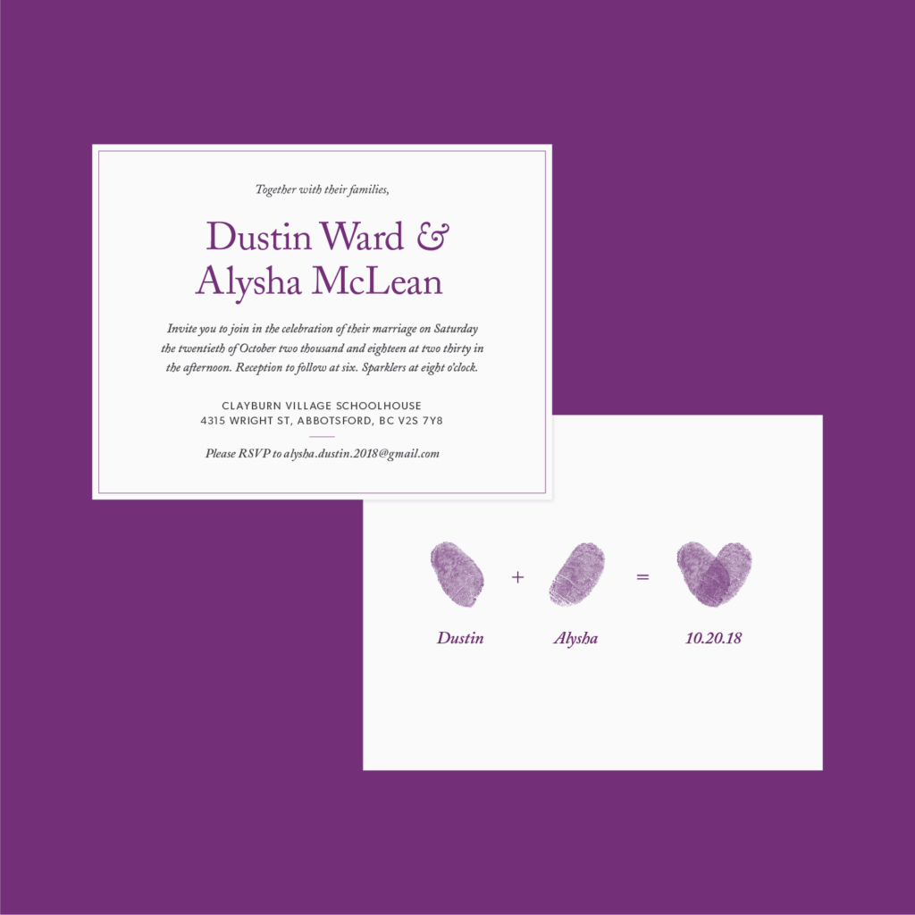
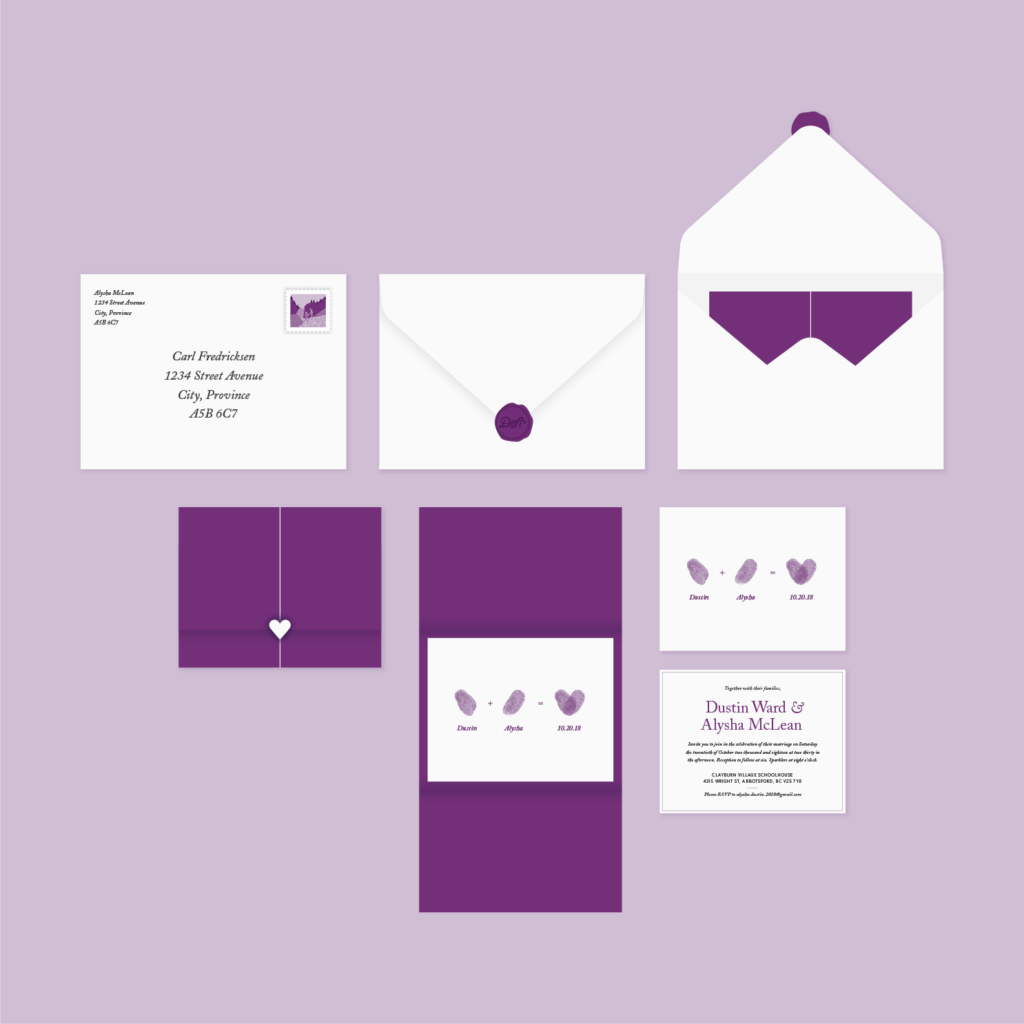
I used each of their thumbprints to create a heart sequence on the front of the invitations, with the wedding details elegantly typeset on the back.
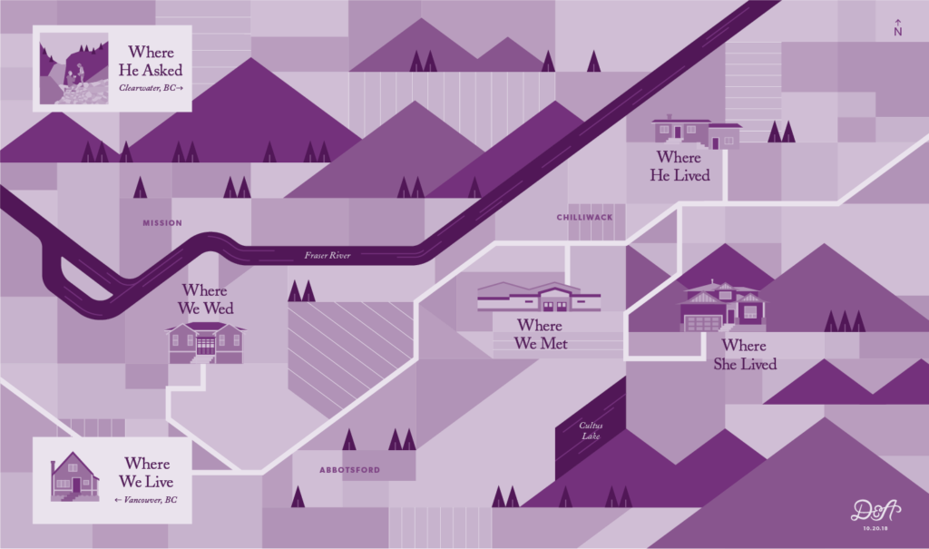
I illustrated a map of stand out moments in their relationship that I plotted on an overview map of the Fraser Valley. Using purple and a clean graphic style, I made the map modern and sophisticated to match the rest of the branding.
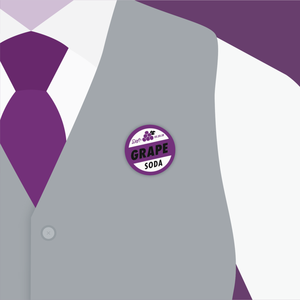
Per request of the bride and groom, I created a grape soda pin, based off of their favourite movie Up! with the emblem and the wedding date for guests to take away as a keepsake.
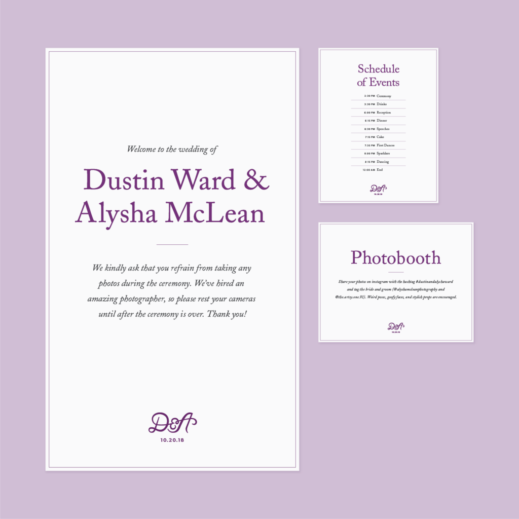
Lastly, I made a few pieces of signage to be displayed around the venue for guests to be informed on details of the ceremony and the schedule of events.